In statistics, diagrams are an inevitable part of your research and data presentation. It is therefore crucial to be aware of all the different types of diagrams you can use. Each of them has a unique ability to represent the data of your research or simplify complex concepts. The following article will give you an overview of the most important types of diagrams and what they look like.
Definition: Diagrams
A diagram is a simplified way of visually presenting data and information, making it easy to understand for the viewer. Each type of diagram has its range of uses, which is why it is difficult to give a detailed definition that fits all of them. However, they can be grouped into those mostly used in mathematics, those that illustrate processes, and those that depict relationships.
Printing Your Thesis With BachelorPrint
- High-quality bindings with customizable embossing
- 3D live preview to check your work before ordering
- Free express delivery
Configure your binding now!
Mathematical diagrams
The first association we most likely have with diagrams is mathematics. At school or university, diagrams are often used to present the results of exercises or statistical observations. The following paragraphs will introduce the most important types of mathematical diagrams.
Bar chart
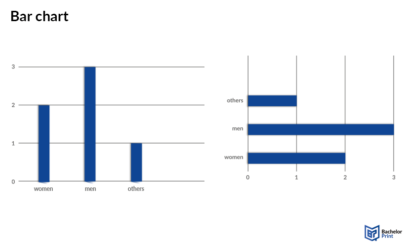
The most common type of diagram is probably the bar chart. It consists of two axes and several bars, which can be either vertical or horizontal. It helps display and compare data from different categories or at different points in time. Other variations like stacked bar charts or grouped bar charts also exist, but will be too detailed for an overview article like this.
The following example shows a fictional study with very little participants, asked to state whether they are smoking or not, sorted by gender. This is no representative study and only meant as an example to explain what the bar diagram shows.
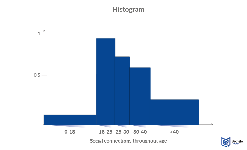
Histograms are very similar to bar charts. The only difference is that the area of the bars is proportional to their value. Histograms are usually used to show the distribution of variables in a more detailed way. The main aspect is that there is no space between the bars because they cover the range between them. The bars can either have different widths according to the width of the groups, or you can choose a simple unit like 1 cm and then calculate the height.
The following example shows the number of social connections or friends throughout different age groups. As a child, your social circle is limited by family and school, which later gets expanded by outside-school activities. Over time, the social circle gets gradually smaller until you most likely have your fixes group of a few friends that hopefully stay forever.
The height of the bars is calculated through the average number of friends the person has divided by the the width of the age group.
Pie chart
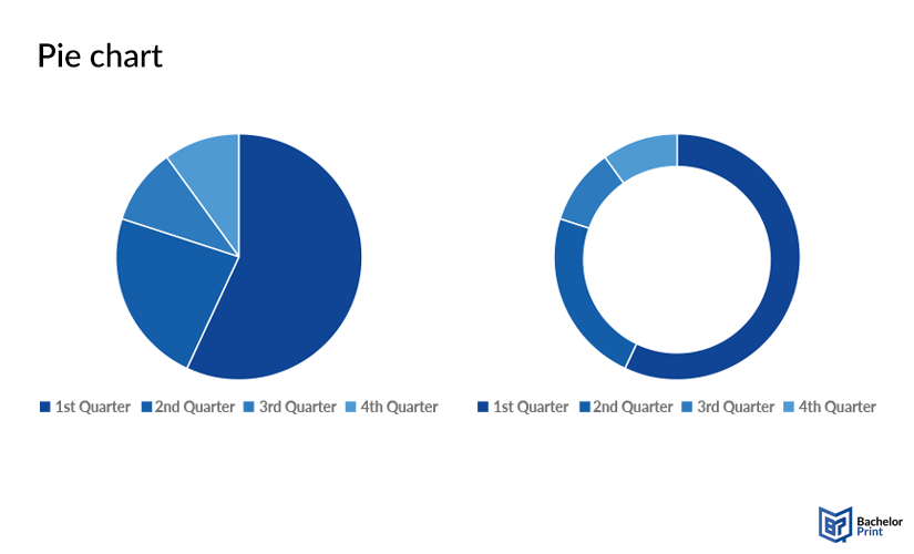
Pie charts display data as slices, showing their proportions as percentages of the total. They are also called circle diagrams because of their shape. However, they can also be formed as a ring in some rare cases, but the aesthetic design is up to the preferences of the individual.
An example for the following diagram could be the sales volume of a company in each quarter of the year, shown as percentage stakes of the circle.
Line graph
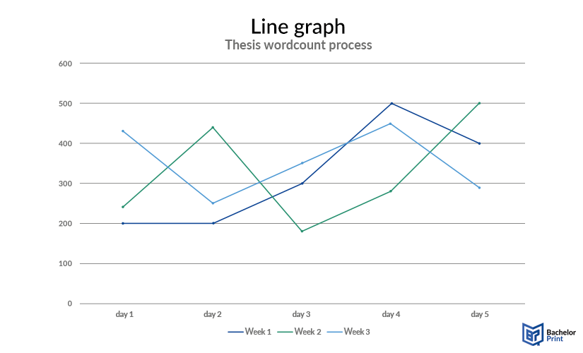
A line graph, also called a line chart, connects data points in a system of coordinates with straight lines. It is mostly used to track numerical data over time.
This line graph shows the distribution of the word count of a fictional thesis over three weeks. The points mark the number of words written on each day, excluding the weekends.
Tree diagram
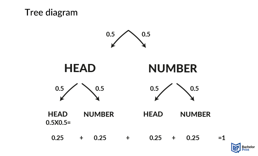
A tree diagram starts with a central idea or factor before it branches out into different possibilities and outcomes. In mathematics, it is used for probability calculations of various events, but it can also be used in processes or even relationship maps.
Heat map
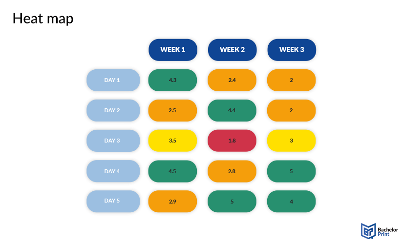
Heat maps consist of a type of matrix with a variable number of fields. The color (intensity) of each field visualizes the magnitude or value of the data it contains. Heat maps are used to compare data or track variations over time, as well as to find connections between different factors in a system.
This graph below could show the number of pages written on your thesis each day over three weeks with a set goal of 4 or more.
Process diagrams
Process diagrams show, as the name suggests, the outline of a process, whether it is a timeline schedule, an order of steps in a project, or the energy that goes into different departments. Process diagrams break down complex workflows into easily understandable parts. The most common types of process diagrams will be explained.
Flowchart
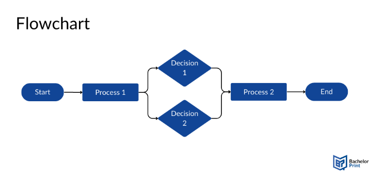
Flowcharts break down a process or workflow into understandable steps that are easy to follow. The flow can either be linear or split at different points, depending on the situation.
The following example is a very simplified one, only meant to show you the basic structure. After the start, there is a process which leads to a decision with two options, which determine the type and outcome of process two.
Gantt chart
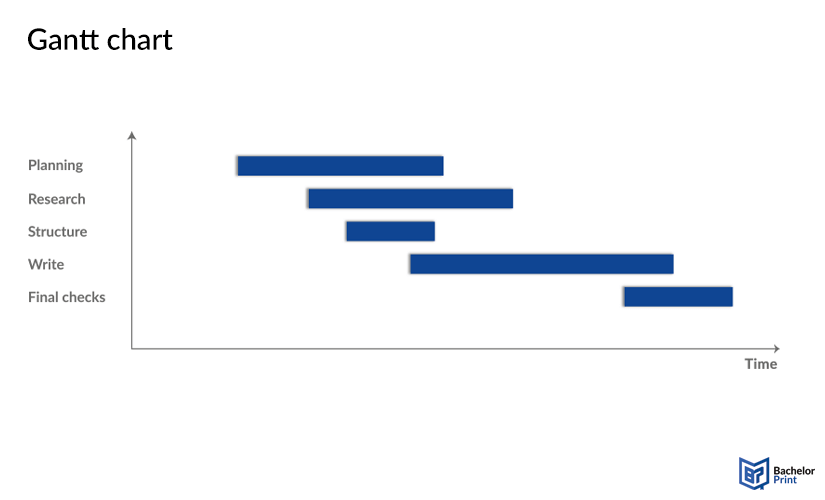
A Gantt chart pictures a work process and its various tasks in a timeline. Each bar represents one task and its duration by length. This way, it is easy to map out which tasks have to be done when and in what order.
This example shows the process of writing a thesis, with each step given a certain time slot. Some of them can also overlap, as the structure can be made after the first rough overview about your topic, just as planning your work schedule does not need to be finished before you start your research.
Funnel chart
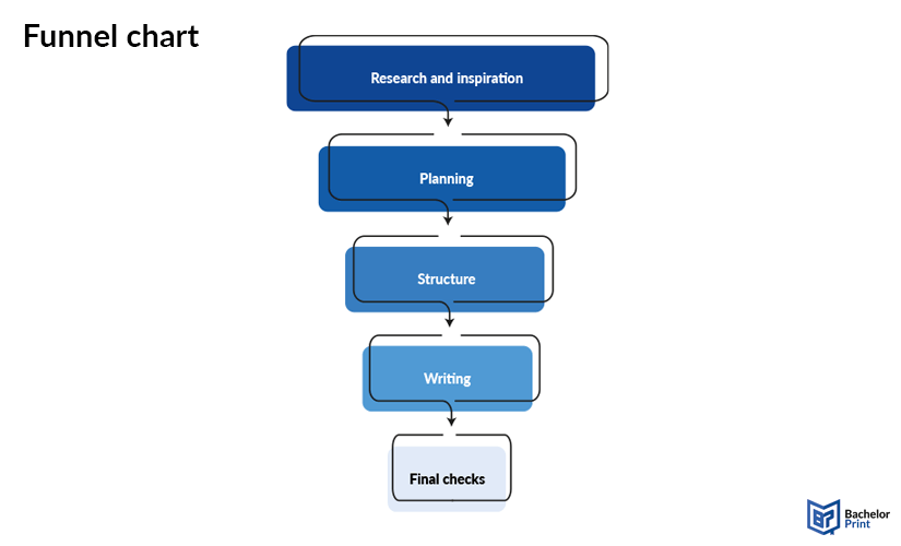
A funnel chart looks like an upside-down pyramid and also displays stages of a process in the order they need to be completed. It can also sort tasks by their importance through the length of the bars.
The funnel chart structures the process of thesis writing in another way, highlighting the order of tasks and their importance.
SIPOC diagram
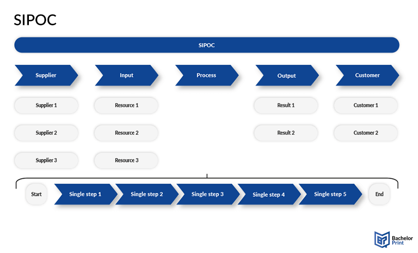
SIPOC is an acronym for Suppliers, Inputs, Process, Outputs, and Customers and describes a way to improve the components of a process mostly in the economy.
Swimlane diagram
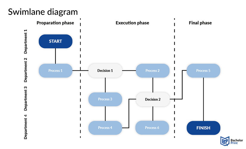
In a swimlane diagram, each box represents a task, while the lines stand for employees or departments. Furthermore, the tasks can also be sorted into superior boxes to further organize the structure. It shows the workflow of complex processes and organizes task forces.
The swimlane diagram may look a little confusing at first, but it is actually pretty simple. The preparation phase starts in department 1, which gives their intel to department 2 to start the first process. In the execution phase, they make the first decision, which leads to them doing process 2 as well as department 3 executing process 3. Process 4 and 6 are handled by department 4. In the end, the results of processes 2, 4 and 6 lead to the second decision, starting porcess 5 in department 2 before department 4 finishes the job.
PERT chart
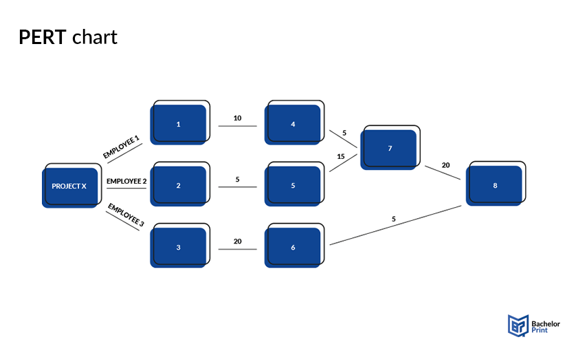
PERT is an acronym for Project Evaluation Review Technique and looks very similar to a flowchart. It also consists of nodes or rectangles with designated tasks or milestones. However, the lines are labeled with the time to spend completing the tasks or the people responsible for them.
In this fictional example, employee 1 will do task 1 in 10 minutes and thereafter, task 4 in 5 minutes. Employee2 will do task 2 in 5 minutes before taking 15 minutes for task 5. Task 7 is then handled by both employee 1 and 2 together in 20 minutes. Employee 3 will do task 3 in 20 minutes and then task 6 in 5 minutes before all three of them will work on task 8.
Sankey diagram
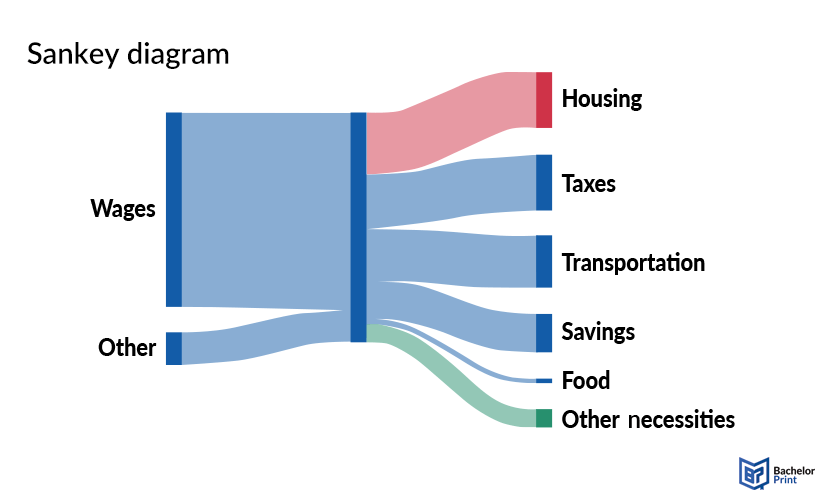
In Sankey diagrams, the flow of data or energy is represented by arrows of different widths. The wider the lane, the more energy or data is flowing, making it easy to see where the focus is.
This example of a Sankey diagram shows how an average employee gets and spends their money, and which amount goes where.
Relationship diagrams
Relationship diagrams draw connections between different entities in a system, or even between whole systems. They describe hierarchies, solve problems, and map out complex concepts in a simple-to-understand way. The following paragraphs will give you examples of different relationship diagrams and when to use which one.
Venn diagram
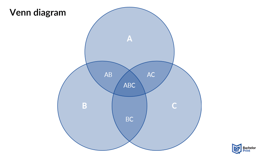
A Venn diagram consists of a variable number of overlapping circles, showing the concepts or relationships in the overlaps. Venn diagrams are also sometimes used in mathematics to represent intersections between sets. In other contexts, it is used to visualize overlaps between departments, authorities, or abstract concepts.
Organizational diagram
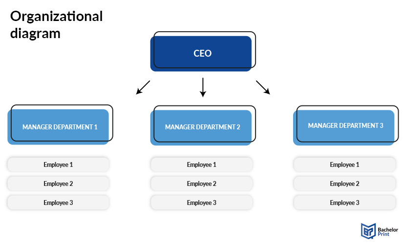
Organizational diagrams are used to depict a company’s hierarchy, authority, or responsibility lane through a vertical structure of boxes representing different departments.
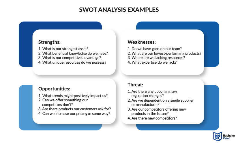
SWOT analysis diagram
The acronym SWOT stands for Strengths, Weaknesses, Opportunities, and Threats, aligning in a matrix to analyze a business landscape. If you want a detailed explanation of the SWOT analysis and how it works, follow the link to the corresponding article in our study guide.
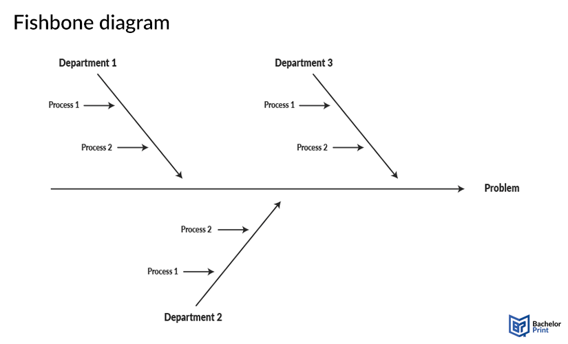
Fishbone diagram
A fishbone diagram, also called the Ishikawa diagram, typically shows contributing factors to a central problem and helps to solve issues this way. It got its name from the fishbone-like appearance, that brings all possible relationships and contributors towards the main lane, visualizing a system as a whole.
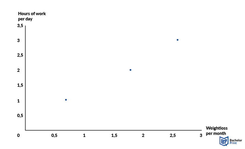
Scatter plots
Scatter plots are dots in a coordinate system, visualizing the relationship between two variables (x, y). They are usually used when it is not about a process or a longer timeline, but individual data, like from participants in a research study. A scatter plot graph is basically a line graph without lines, which often has only one set of data, as dots are less clear to see than lines.
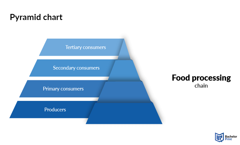
Pyramid chart
A pyramid chart, as its name suggests, is shaped like a pyramid and is usually used to describe hierarchies or an importance ranking. In most cases, it also shows dependencies of the upper blocks towards the lower ones.
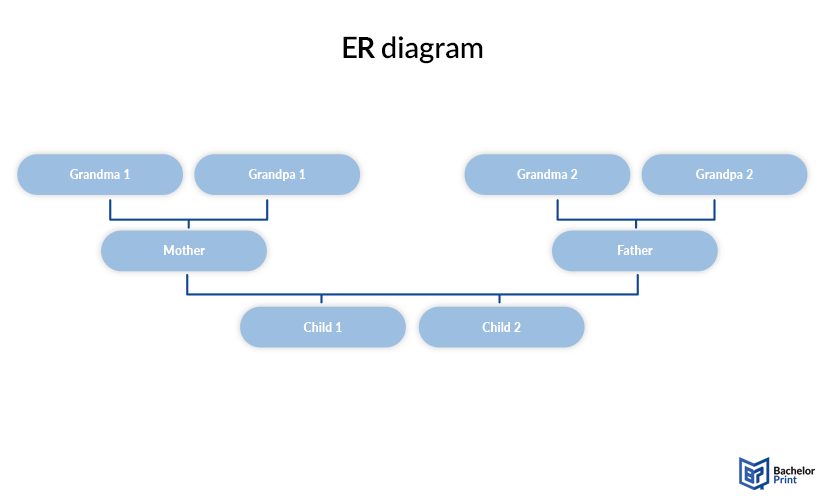
ER diagram
ERD is an acronym for Entity Relationship Diagram, which means that it shows how different entities relate to one another. It is a type of flowchart, which does not refer to a process but solely to relationships. The simplest example of an ER diagram would be an ancestral chart.
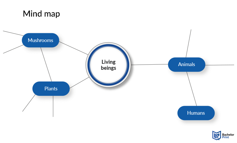
Mind map
Even the simplest mind maps are actually diagrams. A mind map starts with a central idea and branches out into subtopics, which can be divided again. You can also form connections between the different topics. There are no formal rules for mind maps, which is why you cannot categorize them.
Matrix chart
Matrix charts are simply all diagrams with two axes. As such, they include scatter plots, SWOT diagrams, Gantt charts, bar charts, and many more. They do not necessarily have to be mathematical or describe relationships, as even a table is theoretically a matrix.
FAQs
As there are many different types of diagrams, it is difficult to get one universal definition, but in general, a diagram is a visual representation of any kind of data.
The most common types of diagrams are bar charts, line graphs, mind maps, or tree diagrams because of their frequent use in statistics, data analysis, and brainstorming.
A matrix chart is an umbrella term for every diagram that is set between two axes. As such, count scatter plots, Gantt charts, bar charts, histograms, SWOT analysis diagrams, and many more.