There are many different measures and characteristics to gain an overview of your research data. The interquartile range is an essential component that is widely used in statistics, used to describe where the central point of a given set of data lies compared to its extremes. In this guide, you will find a thorough representation of how to calculate the interquartile range of a dataset, how to illustrate it, and discover some practical applications that it can be put to.
Definition: Interquartile range
The interquartile range, in short IQR, is a measure of descriptive statistics, which determines the range between the lower and the upper quartile, which can also be described as the middle 50% of a sample. A quartile is a type of quantile, which divides a sample into 4 same-sized groups of 25% each.
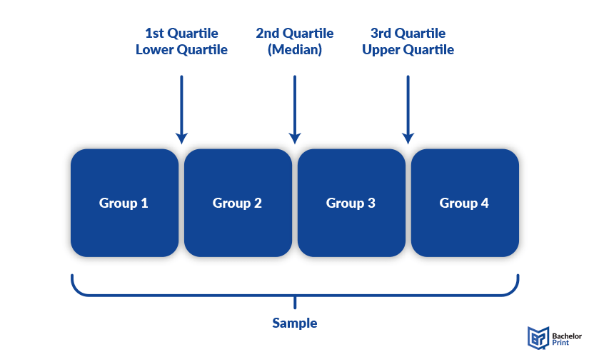
The IQR is calculated by subtracting the lower quartile from the upper one.
IQR = Q3 – Q1 or IQR = UQ – LQ
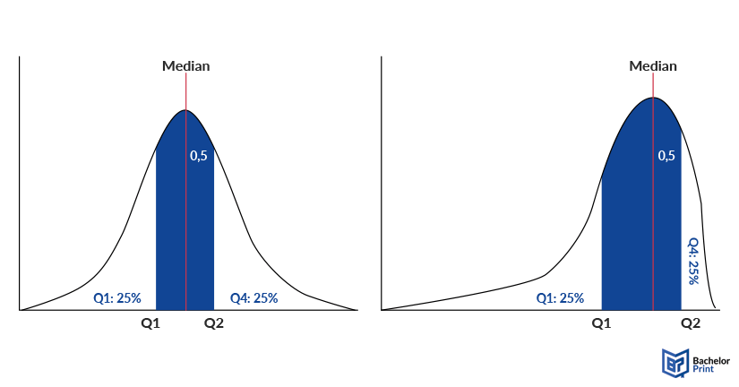
If the distribution is symmetrical, the interquartile range is also symmetrical around the median. If the distribution is skewed, the distance on the x-axis might differ, as the following graphic shows.
Printing Your Thesis With BachelorPrint
- High-quality bindings with customizable embossing
- 3D live preview to check your work before ordering
- Free express delivery
Configure your binding now!
Calculation
There are a few different methods on calculating the interquartile range, some of them depending on whether your dataset is even or odd numbered. Before starting to calculate, however, the dataset needs to be arranged in ascending order. For the exclusive and inclusive method, you also need to determine the median.
Quantile formula
The first method includes the simple formula for quantiles: n*p, where n is the number of values/participants and p is the percentage of the quantile. In the case of the interquartile range, you need the first and third quartile, meaning 25% and 75%. While the interquartile range is, as the name suggests, calculated with quartiles, you can also name them as the 25th percentile and the 75th percentile. These are technically synonyms, as they hold the same values. With this method, it does not matter if the dataset is odd or even numbered.
Exclusive method
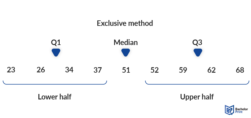
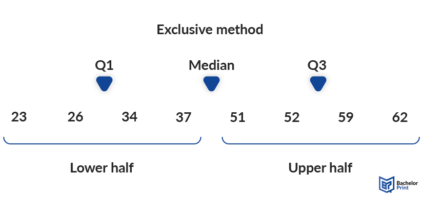
The exclusive method calculates the median first and then excludes it before dividing the sample into two groups.
Inclusive method
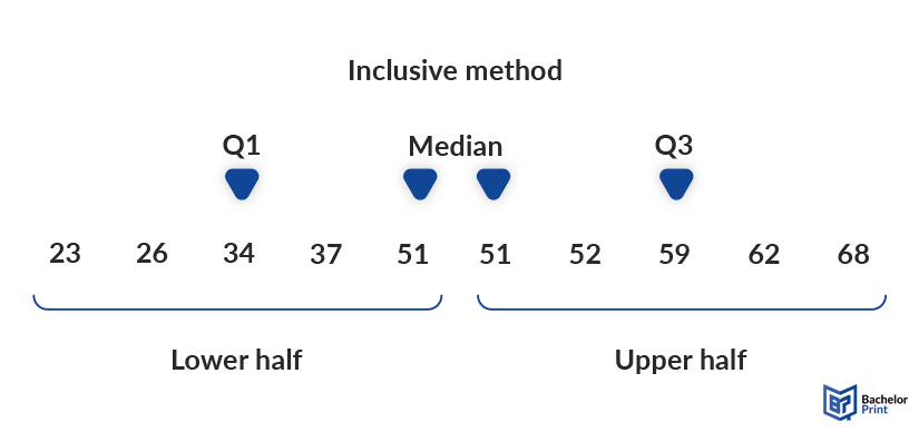
The inclusive method only works for odd numbered datasets, where the median is counted double, once in the lower half and once in the upper half. Even though you could theoretically split an even set into two parts as well, calculating the IQR that way is not common practice and furthermore defies the principle of symmetry around the median.
To be precise, the interquartile range is the exact 50% of values around the median, 25% to each side. If the median is included in one half and not the other, this symmetry ceases to exist, and the method is thus wrong.
Conclusion
In conclusion, you could say that the exclusive method is more suitable for even numbered datasets, while the inclusive method is used for odd numbered ones. When using the interquartile range in research, it is most important to be consistent and clear in your methodology. This does not mean that you have to use one method throughout your whole research paper, but instead make clear when you are using which method and why.
Semi-interquartile range & mid-quartile range
The semi-interquartile range (SIR or SIQR) is half of the interquartile range, also called (inter-)quartile deviation, and it is a measure of dispersion. It is calculated by dividing the interquartile range by 2. In contrast to the standard deviation, the SIQR is not influenced by extreme values in the dataset, showing a more stable measure of variability.
SIQR = (Q3 – Q1) 2
The mid-quartile range is the sum of the first and third quartile divided by 2. In many cases, it aligns with the median. However, it may also differ from that measure of central tendency. Generally, it is rarely used.
MQR = (Q3 + Q1) 2
Boxplots
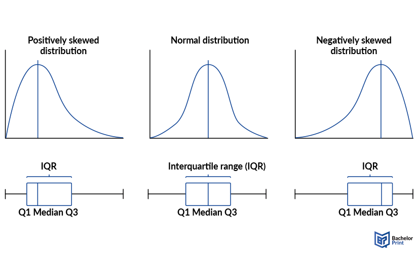
A boxplot, also called a box-and-whisker plot, is the visual summary of a dataset, containing five crucial points: The lowest value, the lower quartile, the median, the upper quartile and the highest value. Depending on where the box is placed, the boxplot shows how symmetrical or skewed the distribution is. A left-shifted box indicates a positively skewed distribution, while a right-shifted one indicates a negatively skewed distribution.
When to use the interquartile range
The interquartile range is best used to avoid outliers influencing the results. When most figures are close to a central point but just a few would drastically adjust the mean average, for instance, viewing only the middle range of data can help to deal with errors or unlikely events.
FAQs
This is the data point that lies 25% from the lowest point. Take the lower half of a set of data and work out the middle value. Or you multiply the number of values by 0.25 and take the resultth number either adjusted upwards as the median value or, if an integral is your result, add this value to the next before dividing the sum by 2.
This is the data point that lies 75% from the lowest point. Take the upper half of a set of data and work out the middle value. Or you multiply the number of values by 0.75 and take the resultth number either adjusted upwards as the median value or, if an integral is your result, add this value to the next before dividing the sum by 2.
Mathematicians don’t agree on whether the exclusive or inclusive method is best. There is no consensus. However, the exclusive method is better suited for even numbered sets, while the inclusive method is preferably used for odd numbered sets.
The interquartile range is calculated by subtracting the lower quartile from the upper one, as the following example shows:
Dataset: 11,12,13,14,15,16,17,18,19,20
Q1 (lower quartile): 10×0.25= 2.5 → 3 → 13
Q3 (upper quartile): 10×0.75= 7.5 → 8 → 18
IQR = 18–13 = 5

